Piscinas no Ponto
An Immersive Water Aesthetic for a Precision Pool Service
An immersive site for a precision pool service, opening submerged in live water caustics and surfacing into clear content that turns visitors into quotes.
Visit the project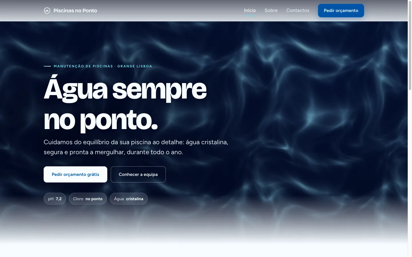
- Outcome
- The promise of "no ponto" is visible before a word is read, and the site still gets a phone visitor to a quote in seconds
- The unconventional call
- Opening the site underwater: a live caustics shader as the first proof of precision, with WCAG AA contrast held even over moving light.
- Disciplines
- DesignSoftware Engineering
- Tags
- Marketing siteLocal businessInteractive web
- Delivered
- July 2026
The stakes
Piscinas no Ponto maintains private and shared pools across Grande Lisboa, and the name is the whole promise: “no ponto” means exactly right, measured and confirmed, never “more or less”. A generic template would contradict that promise in one glance. The site had to make precision felt before a single word is read, and still do the unglamorous job of turning a phone visitor into a quote request in seconds. It also had to stay clearly distinct from its sibling brand, HR Piscinas, which we designed in the same season.
If the promise is precision, the site has to be the first measurement the visitor sees.
The move
The site opens underwater. A dark hero lit by real pool-water caustics, rendered live in the browser, then the page surfaces into clear, airy, legible content. The shader is not decoration; it is the brand demonstrating that it can control water and light. And it is used with discipline: only in the immersive zones, never as noise over reading content, with darkening veils holding WCAG AA contrast even over the moving light, and a static gradient taking over under reduced-motion.
What shipped
A three-page site in Astro (Início, Sobre, Contactos) in plain European Portuguese. Deep, committed blue, bold grotesque type, and generous space, a confident identity that shares a trade with its sibling brand and nothing else. Fast on a phone, and every path ends at the quote form.
What it changed
- The promise of the name is proven visually in the first second, before any copy
- Visitors still reach a quote request in seconds, on a phone, without friction
- Accessibility survived the drama: AA contrast over the shader, static fallback under reduced motion
- Two sibling pool brands now hold clearly separate identities, built on one discipline